#but they’re 3D models and I’m trying to translate them into 2D
Explore tagged Tumblr posts
Text

So yesterday and then today, I was trying to again draw Transformers, this time trying my hand at D-16
I still can’t draw Transformers right, I tell you
These were pretty much my two reference photos, for anyone curious. And this is probably also the reason why I don’t have the best design of him, I only have so many refs. But I already have so many photos in my library, and I don’t have the energy to go looking for like, a dozen photos
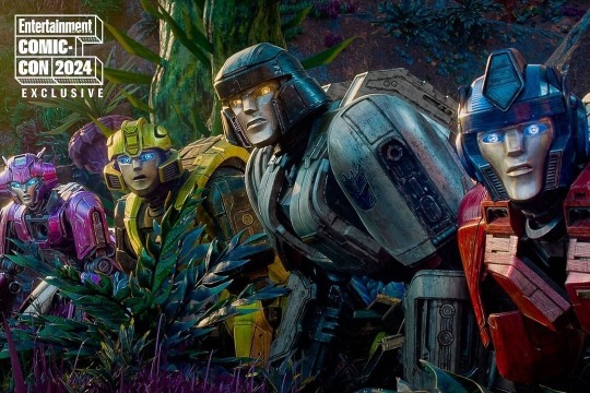
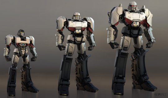
I think by the end of it, I can draw his helmet relatively well, but I quite honestly don’t know how to draw his body. There’s so many parts to it, it’s too much for my brain to handle as someone who draws super simple. With practice it’ll probably get easier, but right now it’s rough
But the thing, the main thing killing me is the face. It always looks wrong when I draw it on
I think part of it is how high up the features are on the face, since I think normally when I draw characters, the features are generally on or around the lower half of the head, while here the eyes are on the top half. But I can’t really move them down because D’s eyes are supposed to be above his helmet vent things, and already as I draw them they’re too low. Where am I supposed to put the eyes so that they fit where they’re supposed to but also don’t look weird?
There’s also the fact that I can’t just do circle eyes on these guys, because it doesn’t really fit the style. But also it means I don’t know how to draw their eyes otherwise, and trying to do more almond shaped eyes doesn’t look right either
Then there’s also the matter of the nose and eyebrows. I see how it looks in the movie, but I don’t know how to translate that to 2D
Maybe it’d be easier if I kept more pictures of how other people draw the characters, but I only keep those as things to show my friend when we meet on Tuesdays, and then delete afterwards because I’m already pushing over 2000 photos on my library and I need to keep that number down as much as I can (I mean I have plenty of space nowadays but I just don’t like it)
I think my main goal should just be to practice more. Which I think also means using a bigger canvas, but I’ve been ruined by the 500x500 and I can no longer do 1024x768 because I’ll never finish the canvas now, so oh well
*sigh* but yeah, this. Oh, to be able to draw the characters
Things were so much easier when it was cookies. And before the cookies ruined me as an artist
#debating trying g1 Megatron next bc those designs are probably simpler right?#they were at least 2D#the TFOne designs feel to me like they shouldn’t be hard and like they aren’t that complex#but they’re 3D models and I’m trying to translate them into 2D#while also not being a very good artist that can draw a lot of detail#anyways yeah#should probably update on this front#I really don’t draw anything of much substance anymore do I?#*sigh*#transformers#transformers one#d 16#my art#art practice
12 notes
·
View notes
Photo
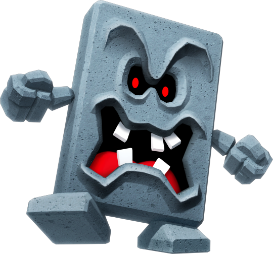
Name: Whomp
Debut: Super Mario 64
You know what I’ve been thinking about lately? Super Mario 64. Haven’t we all, really? Between all the recent datamines and general online discussion, I can’t help but wonder about Super Mario 64!
Something I don’t think Mario 64 gets enough appreciation for, is being the birthplace of our beloved Whomps! At least, I certainly belove them. Don’t you? We’ve covered pretty much every “Thwomp” variant in the past, and sure, Whomps may be nowhere near the “obscure” side of enemies, but a splendid design is a good thing to appreciate anytime!

Not only is this their debut, but they get a whole stage themed around them: the Whomp’s Fortress, if by “fortress” you mean a vague collection of scattered obstacles and platforms floating in the sky, like most 64 stages! That sure is a lot of... textures! My favorite part is the little paddling pool near the bottom.
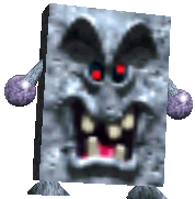
And who could forget the Whomp in all their original polygonal glory? Clearly they just wanted to make an enemy who is just a rectangle with a texture on top, yet the design had all its charm even back then! The sunken eyes with glowing red pupils, the H-shaped mouth with the crooked teeth... it’s very cute, in an ugly way. And on the back, their weak spot is a crack with a bandage on top! Adorable!

If it ain’t broke, don’t fix it- that’s why the Whomp has only really had a few subtle redesigns over the years! When they appeared in Mario 64 DS, they looked just a little bit nicer to look at. They were also in New Super Mario Bros. DS, using the same model- a 3D only enemy in a 2D game, how strange indeed! Their first appearance in a new mainline game in 10 whole years- and it probably just happened because they wanted to reuse assets.
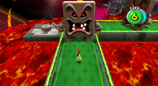

Another redesign? Don’t mind if I do! The Whomp’s grand return to the third dimension happened in Mario Galaxy 2, really cementing them (hah) as a modern Mario classic. This time, they’re huge! And square-ish! And uh, their eyes aren’t wacky anymore. No longer having a band-aid, they instead have a big ground-pound symbol on their back now, which must be just awful, right? Can you imagine having a big logo emblazoned on your back which says “crush me with your butt here”?
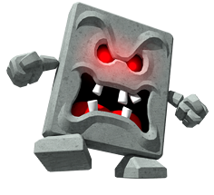
This here is their artwork from Mario Party 9. It’s the same as the art from Galaxy 2, but their eyes are glowy now. I just thought this was funny. But I’m getting ahead of myself here! Before I talk about Mario Party, I need to talk about...
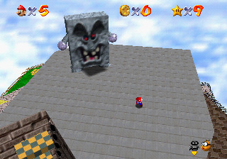
Their monarch, the big bad Whomp King! He’s just... He’s just a big Whomp. He acts just like other Whomps, but he’s big and takes three hits. What’s totally memorable about this boss, though, is the villain monologue he gives before fighting!
��It makes me so mad! We build your houses, your castles, we pave your roads, and still you walk all over us. Do you ever say thank you? No! Well, you're not going to wipe your feet on me. I think I'll crush you just for fun! Do you have a problem with that? Just try to pound me, wimp! Ha!”
Uh oh! Looks like Mario’s world has a little problem with under-valuing essential workers! Good thing our world has nothing like that. Well, jokes aside, it’s a pretty cheeky nod at how the Whomps are made of stone- but one has to wonder much of this tragic backstory is serious! It must be a pretty nasty lot in life, huh?

Don’t feel bad- in 64 DS and Mario Galaxy 2, the Whomp King got a snazzy new crown! At least someone appreciates him a bit!

Well, it wasn’t just him: Galaxy 2′s Throwback Galaxy was one big reimagining of Whomp’s Fortress, meaning this is probably the most Whomp-focused game released in the past decade. The music was remixed, the boss fight was revamped- all in all, a lovely throwback indeed!
And the Whomp has basically just... stuck around! You may have noticed the image at the top (from Super Mario Party) has a slightly different design, being a little more rectangular with smaller, thinner eyes and a more angular mouth! They definitely redesigned the Whomp again at some point, but I couldn’t tell you exactly when... Either way, I’m glad they’re here for good!
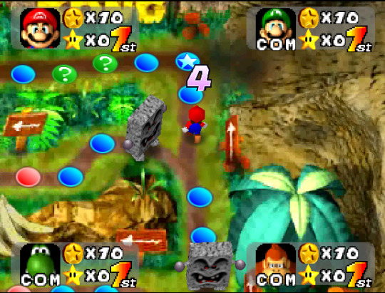
Not that Whomps ever really went anywhere! In the years between Super Mario 64 and its remake, Whomps survived almost exclusively in Mario Party (and other spin-offs), functioning mainly as roadblocks that don’t allow the player to pass!
Which brings me to my final point- between their design and this function, the Whomp is most likely based on the mythological yōkai called... the Nurikabe! And since I’d love nothing more, I’ll now go into a long-winded tangent about what the Nurikabe is, and... Hey, wait!! Come back! It’ll be interesting, I swear! Don’t cut off the post! Hey-
Yeah, yeah. You’re all sick of my long-winded yōkai posts. But I’m happy you joined me here, even if it was out of pity. Let’s talk about the Nurikabe!
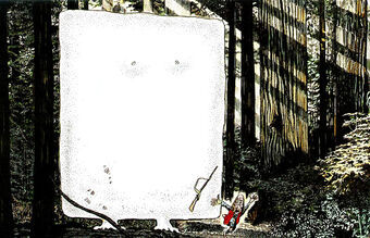
Look at this big guy! What a card! Nurikabe literally translates to plaster wall, and they take the form of a big invisible wall that blocks the way of travellers at night. Since they’re invisible, they naturally don’t have many illustrations- leave it to Shigeru Mizuki to depict them as a large, goofy-looking slab of stone! This Nurikabe joined the main cast of the GeGeGe no Kitaro manga, and thus quickly became a cornerstone (haha) of their popular depictions!

(To be fair, there does exist an old illustration of the Nurikabe as a strange, lumpy dog thing... but I’m not MUCH of a fan? I think a literal stone wall is so much more charming!)

Come on, look at this! What could be better?
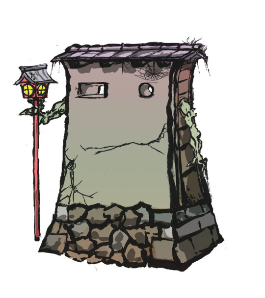
Ōkami has a rather lovely Nurikabe-looking guy! Though his design is splendid, if you’ve played Ōkami you likely remember him as “the extremely frustrating memory puzzle” or “the memory puzzle that is literally scientifically impossible for the human brain to solve”. Shame!
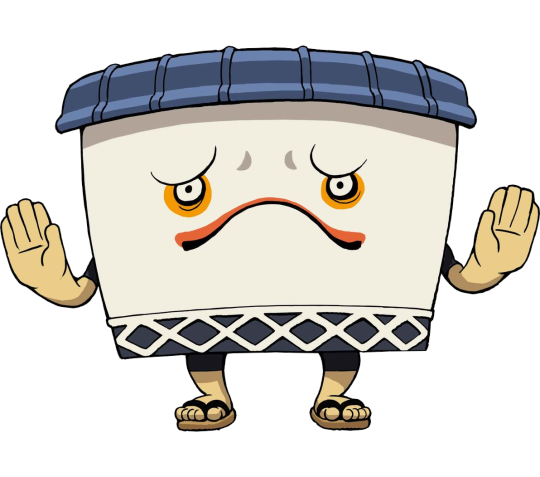
Yo-kai Watch has the Murikabe, a.k.a “Noway” in the English version! “Muri” means “no way”. So like, it’s a pun. Hoho.
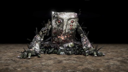
Nioh’s Nurikabe is quite scary, but also rather cool! Don’t you think? I still know very little about Nioh, but whenever I look at its yōkai I think “Dang! That’s cool!”, and I’m right, and it is cool.

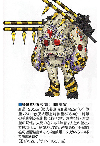
The Super Sentai series has two whole Nurikabe monsters, each based on a different Nurikabe look! While the latter is quite cool, I’m in love with the former and its weird, grungy brick wall look! It’s like, the dictionary definition of Gnarly! Though I know very little about tokukatsu shows, I think its kind of fascinating how creative they can get with designing humanoid monsters suits!
You may be wondering: was this entire post just a thinly-veiled excuse for me to talk about the Nurikabe? And to that I say:
Hmmmmmmmmmmmmmmmmmmmmmmmmmmaybe....???
211 notes
·
View notes
Note
Can we have some unpopular Sonic opinions?
I tried to cram in a lot, so I hope this satisfies you. :P I tried to stick to the ones that I haven't brought up quite as often, since by this point, we all know that I think IDW's storytelling is dire, SA2's story is overrated, X Eggman is an embarrassing portrayal (at least from season 2 onwards), Blaze shouldn't be handcuffed to Silver, Shadow's backstory had issues with or without the Black Arms, Neo Metal Sonic looks silly, etc. But anyway, here we go:
- Knuckles may be tricky to incorporate into plots that don't relate to Angel Island, but making him obsessed with his duties is no better than having him forget about Angel Island entirely.
- I like Marine, and never found her annoying. Oh, I understood what they were trying to do with her, but I honestly wasn't put off by her, and found her Aussie lingo more endearing if anything. Since her debut was during the period in my life where where I couldn't stand Sonic himself, I instead thought he was irritating (and hypocritical) for getting annoyed with her for doing shit he would often be guilty of.
- Silver is just as guilty of being shoehorned into games and plots as the Deadly Six are. Having more fans than the latter is irrelevant, since we're still talking about a character who constantly has to time travel in order to be present.
- Speaking of Silver, if he has to stick around, please do something different with him. They've pulled the doomed future routine multiple times now, and it's been boring every single time. I wasn't interested when it involved Iblis. I wasn't interested when it involved Knuckles drinking the edgy Kool Aid. I wasn't interested when it involved a council of dumbasses... give it a rest already.
- The Tails Doll can work as a mildly creepy thing, with maybe more to it than meets the eye when it's time for a boss fight or what have you. But the memes about him stealing your soul are just dumb, and I thought it was dumb even back in my teenage youth.
- “Eggman is supposed to be clownish!” Yeah, well he's also meant to be a genuine villain with a 300 IQ. These qualities don't have to be mutually exclusive.
- “Sonic is supposed to have attitude!” Yeah, well that's not the same thing as being an absolute cunt. Sonic was only ever meant to come off as having an edge compared to Mario. He was never meant to be a GTA-tier protagonist.
- Rouge is not a villain, and never was a villain. Literally the whole point of her role in SA2 was to reveal that she was working against Eggman and Shadow the whole time, albeit using sneakier tactics to do so. You'd think all those people who exult SA2's story would remember this, but apparently not. She barely even qualifies as an anti-hero, since aside from stealing the Master Emerald, she rarely does anything morally questionable otherwise. She's got a lot more good in her than people give her credit for.
- Captain Whisker is a better Eggman Nega than the actual Eggman Nega. And as far as robot characters in this franchise go, Johnny's design is pretty underrated.
- I don't like Iblis or Mephiles, but I DO like Solaris, and it annoys me that it was out of focus for most of the story due to all the time spent on its less interesting halves. Had they kept the backstory with the Duke and his experiments, and worked from there, I think they could have provided an interesting contrast with Chaos (since Solaris can also qualify as a monster with a sympathetic backstory) instead of recycling the surface level schtick.
- Black Doom may technically be just as bad as Mephiles, Nega, Scourge, Mimic, etc, since he's yet another villain with one-note characterization and fucked over Eggman. But because he never gained a disproportionate fandom, he doesn't annoy me to the same extent. It's easier to ignore him by comparison, and his Dr. Claw voice and face shaped like a lady's delicate part make him enjoyable to mock.
- Likewise, while Lyric is also on the same level as these other villains, it's easier to dismiss him because I was never invested in the Boom games anyway, and being an obvious alternate universe (compared to Sonic X or IDW, which retain the Modern designs and plot elements), it never had an effect on the main series. I also unironically like his design, and if nothing else, at least this snake didn't start a hypnotism fetish across the internet.
- Sally - and the rest of the Freedom Fighters for that matter - have had their importance in the franchise severely inflated. They may have been lucky to be the face of popular media (SatAM and Archie), but they're not these magnificent entities that the game characters are but a speck of dust in comparison to. Having a “legacy” doesn't make them more entitled to shit than any other character, old or new.
- Conceptually, the treasure hunting gameplay is one of the better alternate gameplay styles IMO. But it was let down in SA2 by its one track minded radar (the levels may have been big, but I don't think that would have been an issue on its own if the radar was better). If they brought it back and made it more like SA1's treasure hunting, I'd be all for it, although it would probably be better suited for a spinoff title.
- This goes for a lot of games, but when it comes to 2D, I prefer sprites over models. Not that the Rush models are bad (though the ones in Chronicles sure as fuck are), but the sprites in Mania and the Advance trilogy are just so charming and full of character.
- I actually like Marble Zone. Yeah, the level design is a bit blocky, but I love the concept of an underground temple prison, mixed with lava elements in a zone that otherwise isn't a traditional volcano level.
- I also like Sandopolis Zone. Again, completely understand why it's not the most popular zone around, but I've been a sucker for the Ancient Egyptian aesthetic since childhood (you can thank Crash 3 for that), and Act 1 is visually stunning.
- I prefer the JP soundtrack for Sonic CD over the US version overall... but I also prefer Sonic Boom over You Can Do Anything.
- SA2's soundtrack isn't bad by any means - I love Rouge's tracks, and The Last Scene is one of my favourite pieces of music - but as far as variety goes, it's a step down from SA1's soundtrack.
- If Sonic X-Treme had been released, it probably would have been unenjoyable and confusing. Whatever your thoughts on SA1, it was probably the better option between the two as far as Sonic's first legitimate translation into 3D goes.
- I have no qualms with Modern Sonic and the other Modern designs and characters, but I also fully acknowledge that changing gears from Adventure onwards - and doing it with a great amount of fanfare - was always going to create one of the biggest divides in the fandom, and fans shouldn't act surprised that this happened. The fact that they felt the need to hype up a new design and direction in the first place (compared to Mario, who has mostly been the same since the beginning, with only the occasional minor change with little fanfare) also indicates that they weren't confident enough in Sonic and his universe being the way it was, which often gets ignored by all the “SEGA have no confidence!!!” complaints you see with their recent games.
- Unleashed did not deserve the incredibly harsh reviews it received back in the day... but it doesn't deserve its current sacred cow status either. It had more effort put into it than '06 to be sure, and I can respect that, but much of it was misguided effort, and even if you like the Werehog, you have to admit that the idea came at the absolute worst time. The intro cutscene may be awesome, as is the Egg Dragoon fight, but 2% doesn't make up the entire game. Chip was also quite annoying, and I wasn't particularly sad when he pressed F in the chat at the end.
- On the other hand, while Colours definitely has its shortcomings, and people have every right to criticse those shortcomings, a lot of its most vocal detractors tend to have a stick up their arse about the game because people actually enjoyed it, and it had a gimmick that people actually liked. Yes, it may have been the first game to have those writers everyone hates, but then SA1 was the first game to give the characters alternate gameplay styles and have other villains upstage Eggman, so...
- Forces is absolutely not on the level of '06. It's nowhere close. A game being flawed does not make it the next '06, clickbait YouTubers. Or should I say, the game they want to retroactively apply '06's reception to, since they've been trying hard to magically retcon '06's own quality...
- To echo @beevean, ALL of the 3D stories have their issues. SA1 is probably the most well-rounded of them on the whole, but even that one isn't perfect.
- To echo another opinion, although I do love SA1, I'm not crazy over the idea of a remake, and would prefer them to just take Sonic's gameplay from SA1 and work from there. Because with a remake, you're stuck in a hard spot: Do you keep it the way it is bar the expected graphical upgrades, and risk accusations of not doing anything to actually improve the experience? Or do you try to address past criticisms, and risk the wrath of the fans who will inevitably go on a #NotMyAdventure crusade about it? What people fail to consider is that the Crash and Spyro remakes were accepted gracefully because their original iterations were still unanimously beloved for the most part, whereas SA1 - and especially SA2 - have always been divisive, and have only gotten moreso over the years.
- People take their preferences for the character's voice actors too seriously. I have my own favourites like anyone else, but I don't make a big deal out of it.
- And with fandom voice actors, they usually focus too much on doing a basic impression of their preferred official voice actor, and not enough on the acting. So you end up getting a lot of fan voices who sound like decent impressions of Ryan Drummond or Jason Griffith on the surface, but they sound utterly empty beyond that impression, because there's no oomph or depth to the actual emotions. They think about the actor rather than the character, when it should really be the other way around.
- The thing with Ian Flynn is that he is capable of telling a decent story, and he can portray some characters well. But he's proven time and time again that everything will go off the rails if he's given too much freedom (ironic, given how quick he is to point the finger at mandates when something goes wrong).
- Ian Flynn and Shiro Maekawa are not the only people in the world who are allowed to write for Sonic. I understand that one should be cautious when seeking out new writing talent, but for all the fandom's accusations of playing it safe, they sure aren't in a rush to experiment outside of their own comfort zone.
- And of course, the big one: You don't fix the franchise's current problems by crawling back to its previous problems. It's much more helpful and constructive to discuss the good and bad alike with each of the games. Less “THIS GOOD, MODERN BAD”, and more “This could work, but maybe without that part...”
47 notes
·
View notes
Text
My Three Page Pseudo-Essay on How the Kirby Anime Would/Should Be Made Today
This was written due to @hedeservesbetter tagging my post with “i woukd [sic] love to read this[, Akira]”.
Let me start off by saying there is a little more to this essay than what the original post says. We’re going to touch a number of topics not listed in it, but those are my biggest ideas. Let’s all also note the I don’t hate the Kirby anime. People accused me of hating the anime or trying to make it edgy the last time I made a post like this, and I still don’t understand why. It’s my favorite anime, probably. If it isn’t, it’s up there with Paranoia Agent and Perfect Blue as one of my favorites. Also note that the two “main” versions of the anime (Japanese and English) blend together in my head, and I’ll talk about both of them as though they are the same (because, honestly, you’re kidding yourself if you think they aren’t), but if I need to specify the version, I’ll use their full titles (Kirby of the Stars and Kirby: Right Back at Ya, respectively).
To say that nearly any animation that was made before the late 2000’s wouldn’t be better if it were made today is lying to yourself. There is so much technology we have today that we didn’t have before then. There’s a very big chance that if the Kirby anime was made today, it could be 100% 2D animation instead of half-3D like it was. That’s only possible because of programs like Flash or Toon Boom, which allow 2D animations to be made easier and faster. Most of the reason that characters like Kirby or King Dedede were animated in 3D half the time was to cut costs and development time. It’s hard to draw so many perfect circles and curved lines almost the exact same on every consecutive frame, but this downside is entirely negated by the use of digital animation tools, which allow you to copy shapes from one frame to the next. My sentiments seem to be echoed exactly by the development staff on the anime. Here’s a quote from Yoshikawa Souji (director and a writer on the anime), translated by Ivyna J. Spyder:
“3D is a way to increase the number of frames. If you make a 3D model once, then you are able to make efficient use of that. [...] [I]f it’s 3D, because you make a model, you can make movement from just clicking it.
“Therefore, the animator doesn’t have [a] hard time with drawing and can instead devote their time to movement, and it’s easy to get information of production and camera. [...] Already, it has 3-5 times the movement of normal TV anime.”
There’s also the option of it being a 100% 3D anime, like its 3DS-exclusive short, Kirby 3D. Being made only in 2012, the 3D already looks so much more competent. Of course, I can also point to the many fully-3D cutscenes that have been in Kirby games since then, the best-looking being the ones in Kirby: Star Allies. It’s very obvious that Nintendo has been becoming more competent with its 3D animations and models very quickly, considering their almost company-wide switch to 3D games, as opposed to 2D. Even with a television budget, ignoring the fact that Nintendo and HAL have infinite money to throw at anything they wish, this could still happen. A lot more fully-3D cartoons and anime have been popping up lately, including the visually gorgeous Land of the Lustrous and Miraculous Ladybug.
God, that’s a lot of words to just be talking about animation. And I haven’t even gotten to the part I started this essay to write! Let’s get on with that, shall we?
Escargoon is my favorite character in the Kirby anime, and right now, is my favorite character of all time. While that’s always subject to change, I suspect he’ll always be in the top ten. Anyone who knows anything about me knows I love this guy. I’ve even gotten others who don’t even know of the Kirby anime to love him.
Which makes me infuriated that he’s treated so badly.
You may have noticed I didn’t mention a certain penguin king in that sentence, even though he’s the one most associated with torturing Escargoon. But the truth is everyone, even the anime itself, seems to love to torture him. I don’t get it! I like the gay snail! I think he’s neat! And I’m sure at least a few of the writers and animators do too! So why does he get deprived of sleep and basic self care because “Haha, it’s funny to see him obsess over a robot”? Why does he get possessed by Erasem, causing him to go nearly insane from being forgotten by everybody? Why does he get abused by his boss so much it actually unsettles him when he treats him nicely? I don’t get it! I want good things to happen to him. I don’t want to watch him go insane from something out of his control every thirty episodes. Dedede isn’t treated like this, and he’s worse than Escargoon, objectively.
The anime starting with Dedede being nicer to Escargoon is a really, really good way for this issue to be remedied. Not only is the trope of a villain power couple way more interesting than “man in power beats his assistant who is clearly in love with him in Kirby of the Stars and has a choice to leave at any time in both versions, but doesn’t for some reason”, the latter is just unnecessarily cruel. Even if they don’t date or whatever, Dedede and Escargoon working together to formulate plans would actually be a force to be reckoned with, instead of making everyone that watches the show think “If Dedede is such an idiot, and Escargoon hates him, why haven’t the Cappies just killed him or something?”
Of course, you can have this and have the Escargoon torture porn episodes. Or! Just… don’t. Or make Dedede have an equal amount. Or is Dedede is still “more evil” in this scenario, make him have more. Listen, if Escargoon is still half-good like he is in the anime we got, he doesn’t deserve torture. I never understood this trope. Why do awful things happen to characters that aren’t actually terrible people? Especially for entire episodes?
I digress.
Let’s talk about Sirica. The fan favorite who was in... two episodes (or three in Kirby of the Stars)?
HELLO?
Are you insane, Kirby anime? Why is this character shelved for most of the series? She’s so goddamned cool! Are you OUT OF YOUR MIND? You packed this much character into one episode and not only is she shelved afterward, she doesn’t even get a satisfying ending so GODDAMNED KIRBY CAN BE COOL? This is not even addressing the fact that her mother died to make Meta Knight look cooler! You can read an excellent post about everything I’ve said here, said in a more compact way, but...
I feel like I’m going to scream at the top of my lungs!
I’m so sorry, Sirica. Let’s talk about how we can fix this.
First. Just put her in more episodes! It’s absolutely not fair that I can glean more character from her one episode than I can for Knuckle Joe, and he’s got THREE, but she still isn’t used! I can even think of an episode description right now, in like, two minutes. Here I go: The monster of the week needs to face an opponent who can change tactics quickly. We think Kirby can do it, but it’s still too strong. But wait! There’s a character with a SHAPESHIFTING GUN who can help Kirby defeat the monster! And the day is saved because Sirica is a relevant character in this scenario. It even draws a parallel to the Masher episode. This could also be fun to explore because Sirica is really stubborn and she might just straight-up refuse.
Also what’s up with Galaxia refusing her, by the way? What the hell, Galaxia? I just never understood that. I have no idea how to fix it, so I ended up having to write around it in my own writing, which was really annoying. I don’t see why she and Kirby can’t just fight together after that, even. She sits out for the rest of the fight after getting rejected by the sword. Like you still have a gun, Sirica, you don’t need to move around to use it. OH WAIT, NO YOU DON’T, META KNIGHT TOOK IT. THE ABSOLUTE MADMAN. IT’S BAD, MISOGYNISTIC WRITING!
Oh, I made myself upset. This was supposed to be a positive essay.
Some other miscellaneous ideas I have, that don’t need to be their own paragraphs: What’s with all the one-off characters that seem like they’re going to be important? If the anime was made today, the GSA would probably have a way larger role. If the anime was made today, it probably wouldn’t be episodic (See this video).
I don’t know how to write a conclusion, so here’s a little MS Paint drawing of Sirica instead:
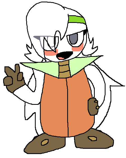
Thanks for reading, and sorry mobile users, if that glitch still exists.
#cant catch me gay thoughts#kirby#kirby right back at ya#hoshi no kaabii#krbay#it takes a lot of effort to write like this i hope u all like it. mwah#also i wrote this very early in the morning so if theres anything wrong with it uh. suck it up
53 notes
·
View notes
Text
answers aa themed questions nobody asked because i’m cool and sexy
also i havent played the 5th or 6th games so
YOUR FAVOURITE…? 1. Favourite Ace Attorney game? honestly? phoenix wright ace attorney! everything’s fresh, there aren’t many weak characters, and the plot is remarkable (especially the fifth case). the whole trilogy is really good as one unit though 2. Favourite case? 1-4, 1-5, 2-4, and 3-5 are tied lol, i can’t make a decision to save my life. 2-1 is really really funny tho 3. Favourite defendant? as a defendant, lana skye. as a person, edgeworth 4. Favourite prosecutor? as a prosecutor, franziska von karma. as a person, edgeworth 5. Favourite ship? wrightworth obviously... ive probably put more thought into them over the last 3 years than any other ship 6. Favourite victim? probably mia fey or gregory edgeworth... but for non-relevant victims, neil marshall :( 7. Favourite murderer? shelly de killer, i LOVE that guy. but dee vasquez was very cool as well 8. Favourite assistant? maya fey!!!!!!!!!! but i like kay faraday a lot too (im so sorry ema) 9. Favourite witness? adrian andrews... or maybe iris? i mean i didn’t like iris but god what a person 10. Favourite quote? “It doesn't matter how many underhanded tricks a person uses... The truth will always find a way to make itself known. The only thing we can do is to fight with the knowledge we hold and everything we have. Erasing the paradoxes one by one... It's never easy... We claw and scratch for every inch. But we will always eventually reach that one single truth. This I promise you.” - Miles Edgeworth i made this one of my senior quotes :]
YOUR LEAST FAVOURITE…? 11. Least favourite Ace Attorney game? uh fucking apollo justice. literally what the hell was that 12. Least favourite case? turnabout visitor wasn’t very strong? i guess it’s fine as an intro, but it’s also wonky with the timeline of aai 13. Least favourite defendant? max galactica. he’s better in the anime though 14. Least favourite prosecutor? manfred von karma, obviously. i like every other prosecutor (who i know of) though, even winston payne is pretty funny in hindsight 15. Least favourite ship? “miles edgeworth/female oc”. there are a lot of bad ships though, mostly involving phoenix & his assistants. dont do that please 16. Least favourite victim? zak gramarye for kickstarting that shitty, shitty game 17. Least favourite murderer? again mvk... but also fucking frank sahwit LMAO 18. Least favourite assistant? i guess trucy 19. Least favourite witness? fuck everyone from turnabout big top unless it was the anime episode 20. Least favourite memory of Ace Attorney? repeatedly trying and failing to download the emulator for aai2 hbjsjhdb i eventually got it but someone had to send me the download fully pre-patched and i felt kinda useless DO YOU PREFER…? 21. Phoenix Wright or Apollo Justice? phoenix wright. fuck that “GOTCHA!” mechanic jesus christ 22. Maya Fey or Trucy Wright? maya fey. nothing personal against trucy but i just dont like aj hbjsdjhsdb also maya is really sweet and fun and she has the best sprites. she seems like she’d be a good friend, it’s too bad that she doesn’t have the time for them as a spirit medium and all :( if maya ema and kay got to hang out together itd be wild 23. Investigations or trials? trials are easier in my opinion because investigations have several things you could be doing without such a linear style, so if you miss something, you won’t really know until you wander around forever 24. College Phoenix or Hobo Phoenix? college feenie!!!!! he’s like trilogy feenie but more emotional and less witty. i like to pretend that hobo phoenix doesnt exist 25. Klavier Gavin or Kristoph Gavin? who would say kristoph 26. Ace Attorney or Ace Attorney Investigations? ace attorney but only because phoenix is in it lmao. im actually rewatching a playthrough of aai now, and playing aai2 at the same time, so while it is on the mind, i feel like the cases characters and mechanics - while loved - don’t hold up to the OGs 27. Apollo’s perceive, Phoenix’s magatama, or Athena’s Mood Matrix? i actually kinda like the mood matrix more than anything because it has a really good UI and the magatama is kinda grating. but FUCK the gotcha mechanic it is SO FUCKING STUPID and IMPOSSIBLE TO USE. where is logic chess 28. Ace Attorney trilogy or Apollo Justice and Dual Destinies? you already know my answer to this one 29. 3D models or sprites? i do like the 3d models a lot but i like the original sprites more! imo original pixel sprites > 3D models > HD sprites. mostly bc the hd sprites are garbage (see here, here, and here) 30. Ema Skye as she is in Rise from the Ashes or Ema Skye as she is in Apollo Justice? rfta !!!!!! shes actually really nice as an assistant, esp considering the fact that we actually see her interact with her sister, which is something maya didn’t have very often. also her random appearance in aai was well appreciated by me
MISCELLANEOUS 31. Did you like what they did to Phoenix in Apollo Justice?
NO I AM SO FUCKING MAD WHY WOULD THEY DO THAT TO HIM ISN’T HE A LAWYER WHY COULD HE NOT JUST DEFEND HIMSELF FROM THE FACT THAT HE “FORGED EVIDENCE” IT WASN’T EVEN HIS IN THE FIRST PLACE SOMEBODY ELSE FORGED IT AND HE DIDN’T KNOW THAT, MANFRED VON KARMA GOT AWAY WITH A FUCKLOAD OF NONSENSE AND SO DOES EVERY OTHER LAWYER SO WHY IS IT THAT PHOENIX CAN SURVIVE EATING A POISONED GLASS NECKLACE AND GETTING HIT OVER THE HEAD WITH A FIRE EXTINGUISHER AND FALLING FROM A BURNING BRIDGE INTO A RUSHING RAVINE AND BEING HIT BY A CAR BUT HE CAN’T FUCKING DEFEND HIMSELF LIKE HE DOES IN EVERY OTHER CASE BECAUSE THAT’S THE POINT OF THE GAME AND ALSO HIS ENTIRE CHARACTER
32. Your opinion on Dai Gyakuten Saiban? haven’t played it! it looks pretty cool though
33. Do you think Dai Gyakuten Saiban and/or Miles Edgeworth Investigations 2 will get localised to the West? doubt it, since the creators have said that it won’t be. but the fan translations are pretty good, so i think it’s okay
34. Do you think Miles Edgeworth should get another Investigation-game or do you think another character deserves a spin-off? i mean he already has two, so i guess he doesn’t need another? like i love edgeworth but he’s not as fun without phoenix around. ngl i would play a franziska game. or a maya game, or any spinoff revolving around a side character. hell i’d play hotti game if it meant it took place in the trilogy era
35. Opinion on the soundtrack of the Ace Attorney-franchise? REALLY good. really really good. i love how each game of the trilogy has different composers but each track has the same theme and feel!!!
36. Do you like where the franchise is heading or did you prefer the atmosphere in the original trilogy? seriously absolutely completely prefer the trilogy. i’m sorry but the rush of youth and trust is way, way more enjoyable than whatever “i’m 35 and therefore middle aged” nonsense is happening in the 2020s
37. Capcom suddenly announces that Phoenix will no longer appear in the Ace Attorney franchise! Your reaction? He’s been replaced by Penny Nichols. Fuck you.
38. Capcom suddenly announces that the Ace Attorney franchise has ended for good! Your reaction? it was me i ended it
39. Would you like there to be another Ace Attorney/Professor Layton crossover game? i didnt play it but i really like the idea!!!!!! aa crossover games are really funny to me, i mean have you seen edgeworth in project x zone 2, lmao
40. Would you like an Ace Attorney anime? we have one now! honestly i don’t think it did a very good job of representing the cases, but it did do a good character remix of turnabout big top so that they’re not creepy anymore. they also did a really good job with the anime-specific cases, like the one on the train! it feels a lot better paced when it’s intended for that medium rather than just adapted. also the childhood episodes made me cry
41. Opinion on anime cutscenes in Ace Attorney? like in 5 and 6? mm, the art style is kinda weird, and i don’t really like the voices, but i guess not everything can be pachinko and prozd
42. Would you want to play an Ace Attorney game where you take on the prosecutor’s role? YEAH ACTUALLY!!!!!! it might be kinda weird being on the right side of the screen though lmao
43. Do you like having DLC in Ace Attorney-games? uhhh i hate having to buy extra things, but i’ll admit that they are pretty funny
44. Opinion on Lamiroir’s storyline? i only played aj so if shes in other games idk but i thought she was fine
45. One thing you think the Ace Attorney games can improve on? stop having creepy characters please. also jesus christ if phoenix and edgeworth arent wearing rings in aa7 i will become the ceo of capcom myself
46. Capcom suddenly announces an Ace Attorney movie! Would you like it to be based on an already existing case or would you like an all new storyline? i mean the musical did a pretty good job of adapting existing cases, so it might as well be new. it would be kinda hard to balance the games’ timeline & character development without being repetitive or an au
47. Capcom suddenly announces an Ace Attorney movie! Would you prefer it being live-action, 3D animated or 2D animated? stylized 2D animation, probably? i would want it to feel more like into the spiderverse than an anime, though. in my dream ace attorney movie, they’d just need a high art budget, several plausible deniability wrightworth scenes, and prozd to voice edgeworth
48. If there could be an Ace Attorney crossover with whatever franchise you’d like, which one would you choose? (Does not need to be a video-game franchise) your turn to die is probably closest in characterization, although its premise is more “locked in a room” than the open-world investigation of aa
49. Opinion on recurring witnesses? (Wendy Oldbag, Lotta Hart, Larry Butz, etc.) honestly, i like them a lot! i don’t know why people hate them so much - i mean, i know lotta lied, and wendy is a horrible old flirt, and larry just kinda sucks all around. but they’re also pretty funny to have around! larry is a constant comic relief who reminds you how much better nick & edgey are in comparison, lotta is likeable as a general character (like in 2-4, although yeah, not remarkable), and wendy oldbag is really funny. she’s so fucking funny. none of you appreciate wendy oldbag’s quirks and you are SLEEPING ON IT!!!!!!!!!!!!
50. Do you think Dual Destinies deserved its M-rating? no idea, holy shit, it got an m-rating? i mean every game before it has had blood violence and very mild swearing, and since DD probably doesnt have anything too sexually risqué, i doubt it deserves a rating any harsher than the rest of the series
okay thanks thats all
#this was fun hbjsdsdj#yea i love the trilogy#also my theme makes all everything lowercase for some reason? so this is probably easier to read on mobile#ace attorney
4 notes
·
View notes
Text
The stylization is *probably* covering for technical workarounds. Hair can be an intense resource hog (not as bad as it used to be, but I don’t know how much technical/artist power the studio doing the show is working with/what the deadlines are.)
It could also be that what was drawn in 2D didn’t make a good visual translation. Smaller, tighter details may have gotten lost in the concept design once rendered out in 3D, looking flat or unnoticeable on the 3D models, requiring them to be scaled up to be more visible/less out of place. May have been to get more body out of the strands, so it’d be less strain on a physics/lighting sim, as well as making it read better in a pose. (I’m thinking that a heavier curl strand would rigged for something like, say getting zapped by Frankie or a dramatic wisp blowing across the face.)
I honestly don’t know if they’re working from a “Mattel/Nick is breathing down our necks-deadline-GOGOGO” situation or “huh, this just didn’t work out the way we expected to, let’s try something else” situation.
Okay so at this point I’m pretty certain the issue with all the curly haired characters not having the same hair as their concept art, is due to the animation style.
Like Clawdeen, Clawd and Howleen all had tighter curls in their concept art. But the finished product gives us looser and less defined curls.
And at first when it was just Clawdeen with this issue, I was pissed because I thought it was intentional. But after seeing Clawd and Howleen I think it really may just be the animation style??
I’ve seen people who know more about CGI animation and such point out that proper curly hair and black hair styles can be difficult to recreate on 3D models, so maybe that’s the case here??
-
Or it could be intentional, who really knows 🤷🏾♀️.
I’m just trying to give them the benefit of the doubt cause from what I’ve seen of Clawd, it looks like they tried to make his hair match his concept art for the most part.
And it kinda looks like they made Clawdeen’s hair bigger the way they did to like… give it the illusion of being curlier?? If that makes sense.
Idk, but if anyone knows more about how CGI animation and animating hair works I’d definitely love to hear your thoughts on this!
149 notes
·
View notes
Text
Ritaban Das: Storyboarding for Effective Storytelling
Character designer, illustrator and storyboard artist, Ritaban Das, elaborates on the significance of storyboarding to effectively tell a story and thus also shares insights from his decade-long experience in animation.
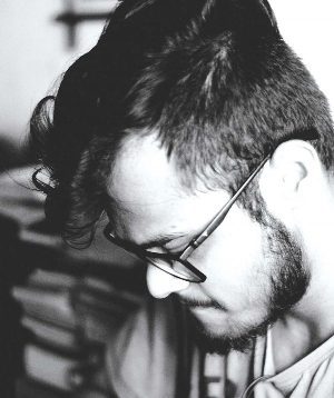
Ritaban Das is a character designer, storyboard artist and illustrator working in the animation industry for the last decade. He’s worked on a wide range of national and international 2D and 3D animated projects for platforms like Nickelodeon, Cartoon Network and Pogo. Recently, he shifted to Toronto, Canada for higher studies, looking to contribute his skills to the Canadian animation industry. He hopes to someday work on his own animated show.
ORDER A CUSTOM ILLUSTRATION
Q. How do you differentiate your approach between the roles of character designer, storyboard artist and illustrator?
Ritaban Das: At the end of the day it’s all interconnected; it all comes down to ‘story’. When I design a character, I start by thinking about what kind of personality the character has and their role in the story. I think about what I’m trying to communicate through the illustration. This helps me to figure out poses and expressions. As I’m drawing, I’m thinking about shapes, proportions and appeal. I also think about the composition of the illustration. When I make storyboards, I’m telling a story in motion by acting out the characters in them.
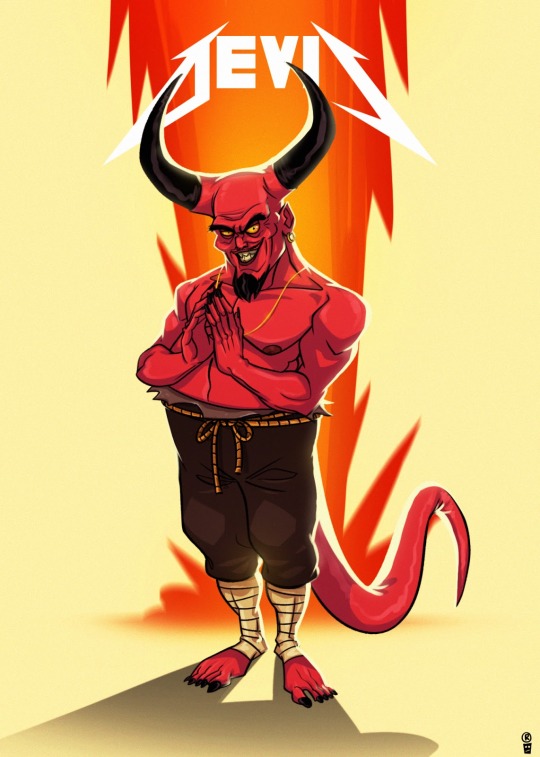
Q. What have been the greatest lessons you’ve learnt professionally and personally in your ten years of experience?
Ritaban Das: Draw what you like and the rest will fall into place. Only you know what motivates you.
Q. How did you find your calling to be an artist and, thereafter, how did you nurture your skills to hone your craft?
Ritaban Das: I’ve been drawing for as long as I remember and I’m always very passionate about it. To be very honest, I sucked at studies and my parents knew that very well. I remember spending most of my time with a box of chalk and slate gifted to me by my father. Like every other child, I also loved to sketch my favourite cartoons. I usually sketched these animated characters on the back pages of all my notebooks and also my classmates’ notebooks. It made me known amongst my seniors for my sketches.
That’s the only thing I was good at which I followed blindly. Honing my craft came from lots of practice. I draw almost every day. I also follow and study other artists’ work. Reading or watching their interviews, where they describe their work processes and the likes, helped me a lot to grow as an artist over the years. I try to open my eyes and ears to absorb everything.
Q. Could you take us through your process of how you envision a character and then execute it practically?
Ritaban Das: Being a Character Designer, most of my work is very much character-driven, blended with humour and very graphical too. I always try to convey some sort of story through every character or Illustration I make. I like to play with various shapes and silhouettes and usually keep things simple.
The character design process is, in a way, a combination of different things. I ask myself ‘Who am I drawing? What is his/her personality?’ I sometimes look at influential artists’ work to get some ideas or even start from a drawing I like and translate it into my style. Then, trying to forget those influences, I often start from scratch with a basic shape such as the face as it determines the rest of the character for me, then the body (this can be a circle, oval or even a pear shape – it all depends on the personality of the character I want to draw).
Q. Could you please elaborate on your current pursuit of higher studies and how you came to choose Canada for it?
Ritaban: I completed my studies at Humber College in 3D modelling & VFX and Graphic Design and got a job in an animation studio called House of Cool as a Story artist. I’m working on a very exciting project which will probably start airing next year.
I’ve always been well aware of the Canadian animation industry from the beginning and the kind of projects they do. I worked on a bunch of Canadian animation projects back in India.
We used to do a lot of outsourcing for studios here like Big Jump and Brown Bag Films. Canada’s animation industry always attracted me in terms of work culture, the kind of content they nurture, and the quality they produce, so I want to be a part of it.
“Whether you’re working on a commercial TV spot, web video or film, storyboards are an effective way to quickly tell a story. “
Q. What about the world of animation draws you towards it?
Ritaban: Animation is important because it enables us to tell stories and communicate emotions and ideas in a unique, easy-to-perceive way that both children and adults can understand. Animation has helped connect people throughout the world in a way that sometimes writing and live-action films cannot.
Today, anyone can pick up a drawing tablet and show their ideas to the world. Drawn figures can be funny, sad or serious. It can have a playful, less intimidating feel to it to make the viewer feel more comfortable. Often, it has simply served as a way to make a heart-warming story that makes you think.
Through live-action movies, people can form biases based on the appearance and real-life personality of an actor playing a character. But as an animated character, the character feels like their own being.
Q. What would you say are the most challenging aspects of working in the animation world and how do you tackle them?
Ritaban: Every project is challenging in different ways. The challenging ones are the projects where clients don’t have a clear understanding of their audience and outcome, goals or don’t have an investment or hierarchy for arriving at a consensus on feedback. The most challenging projects always boil down to size and scope and managing a team to produce the animation. Also, animating subject matter that I’m not interested in is challenging. But at the end of the day, we all survive because we all just love what we do.
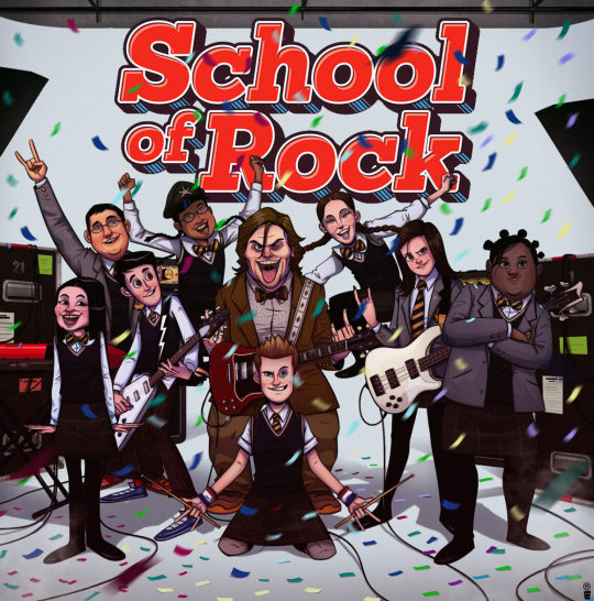
Q. Could you take us through your process of creating a storyboard and highlight its most important aspects?
Ritaban: Whether you’re working on a commercial TV spot, web video, or film, storyboards are an effective way to quickly tell a story. A storyboard is a sequence of drawings that represent the shots planned for video production. It covers all of the major shots, angles and action of your film. The very first step is to read your script and visualise it as an audience would. As I go from scene to scene, I analyse the screenplay and decide how I want each scene to look.
A script breakdown tells you what storyboards you need to create. Then I start doing the rough thumbnails with all the necessary camera angles in Photoshop and chalk out the entire scene I’m planning to do. The important thing is to give anyone who looks at the storyboard a sense of space — where are the objects in relation to the space they’re standing in.
Once I finish locking the scene on thumbnail level, I pitch it to my art director or creative director and take their feedback. After passing the thumbnail phase, I start making the rough staging in Storyboard Pro and work on the required actions and move forward with the scene for the final animation. I might have to rework scenes over and over, combining different elements of the iterations until I finally have what the team is looking for.
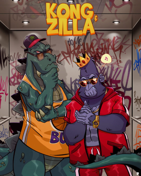
Q. What ways do you apply to understand client needs better and thereby produce results that are in sync with them?
Ritaban Das : Whether I work in any studio or as a freelancer, I always listen to what clients need. Listening to your client will help you understand and retain the information you’re already receiving, even if it isn’t a formal meeting. You need to ask questions to identify needs and paraphrase what they say. It helps with clarification and to enhance your understanding of their needs.
Also, I bring new ideas to the table. I don’t hesitate to propose something other than what the client had in mind. You may have a better service in mind and, if nothing else, this again shows you’re listening and attempting to understand your client’s needs. Understanding client needs is one of the biggest challenges of any business but also one of the most important and rewarding tasks.
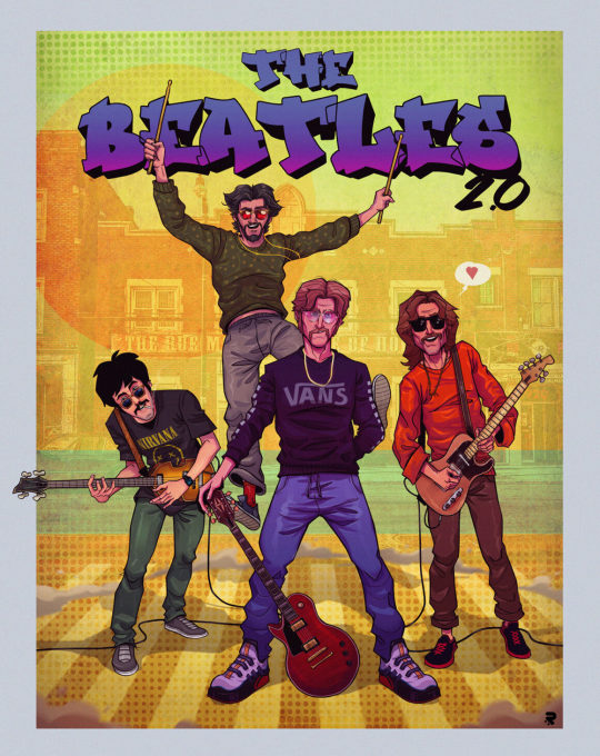
Q. Considering your range of work, could you please elaborate on significant projects and clients you’ve worked for?
Ritaban Das: Over the ten years of my career, I’ve worked on various national and international projects back in India for clients like Nickelodeon, Cartoon Network and Pogo. I’ve been part of the projects like “Camp WWE”, “F is for Family,” “Kuu Kuu Harajuku,” “Evan the Epic,” “Penn Zero: Part-time Hero,” “DC Superhero Girls,” “Cloudy with a chance of meatballs” (series), “Rhythm Warriors” (series-in production) and other numerous animated TV shows.
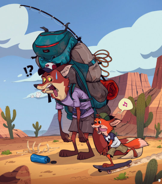
Q. According to you, in what direction should animation be exploring and progressing now?
Ritaban Das: Animation is an incredibly versatile medium that is widely used in many different forms today. Animated films are big business nowadays. Companies such as Disney have had enormous success producing animated children’s films for many years. Animated characters such as The Simpsons and The Flintstones have long been familiar visitors to our television screens. The future of animation looks to be on an interesting journey as the quality of films is becoming higher and higher. Most people would now aim for a 4k film. Also, they’ve been experimenting and coming up with new techniques of animation.
One of the interesting ones is Mix Media, a technique that Disney has been experimenting with for a few years is mixing CGI and traditional 2D animation. The idea is to create an animated film using CGI and then to draw over each frame to give it a hand-drawn quality. The computer gaming industry is also pushing the boundaries of what is possible with animation, leading to the creation of some extremely realistic game footage. Computer game animation has certainly come a long way from the 2D graphics of early arcade games.
Now computer game animators can build environments and objects that react to the player’s actions. The animation looks set to continue delighting audiences for many years to come. With animated films continuing to rise in the blockbuster charts, capturing hearts and imaginations, there is no sign of this genre coming to an end.
0 notes
Text
Rhythm Paradise/Rhythm Heaven
Do you know those moments where you just don’t know what to play at some points? Yup, this time I have no idea what to review. So, let’s see what I’m playing right now... Oh, Rhythm Paradise... from 2009. (This review was from 2014 and usually back then, I reviewed more current games than older ones)
First off, a bit of background to this game series:
This is the sequel to “Rhythm Tengoku”. The first game was only released in Japan for the Game Boy Advance.
The very successful Japanese music producer, writer for lyrics and vocalist Mitsuo Terada or more well known as „TSUNKU♂“ visited Nintendo one day to pitch an idea for a rhythm game which won’t have any visible commands to know the rhythm. Because of the lack of a musical score they were sceptical and thought it would only appeal a small group of people. It was developed for the Game Boy Advance because of the desire of having a small screen and the portability.

(Screenshots of the Game Boy Advance game)
The game was a success and was praised everywhere. Sega ported it because of its popularity with Nintendo’s staff under the title “Rhythm Tengoku: HD Remixed Edition”.

The sequel was released 2 years later for the Nintendo DS.
Because of the integration of the touchscreen for the DS, the game only uses the touchpen. You hold the system sideways like a book and tap or flick with the stylus to the soundeffects or voices.
Flicking on the touchscreen can be a problem because the game can sometimes not notice if you just flicked or just let go. This can be a problem when you don’t know how to safely flick, especially at games where it requires from the player to constantly flick all the time.
You have to do a different task depending on the minigame. Switching between tapping in the beat and off-beat, waiting for the right time to flick, tap and flick, imitate different things in the rhythm of the beat and more.
One minigame has a farmer who pounds the ground to catch vegetables and throw away moles. You are in a choir of three in another minigame where you hold the touchpen on the screen to shut up and let go to let the player sing. And in another minigame, you’re a monkey in a group of other monkeys that cheer a singer on.

Rhythm Paradise has 50 minigames which are divided into 10 rows with 4 minigames and one special minigame, a remix, which is a compilation of past minigames.
Some games are cute, some a odd and others are crazy. The whole game is very similar to the WarioWare games which often contains minigames that made no sense either.
The game ranks you on your performance in the minigame with “Try again!”, “OK” and “Superb”.
At “Try again!” you have to repeat the minigame.
If you achieve “OK”, you can play the next minigame but you won’t earn a reward.
With “Superb”, you’ll earn 1 out of 50 medallions which can unlock new optional minigames.
Once you earn a „Superb“, it can be that the past minigame can also get another objective where you play the entire minigame again but this time, you have the objective to play the game without one single mistake. You have three tries until the objective disappears and you’ll have to wait until it appears again.
Once the objective appears and you did everything successfully, the game will reward you with either the background song, the lyrics to the song or something to read about the minigame.
The “perfect” objectives are optional though so if you don’t want to play them, you can just ignore them and move on.
And if you’re stuck at a minigame and lose 3-times in a row, you have the option to skip it by visiting the cafe.

The game has an excellent score and it always gives the player a sign when to do what. The songs often get stuck in your head, especially the songs with vocals. Each song got translated into English, German, French, Italian and Spanish.
The graphics almost always use 2D sprites but sometimes it uses 3D models that are often blocky mostly because the WarioWare games also have these kinds of 3D models.

Almost all minigames were really fun to me because they’re simple yet tough.
Even with the problems of flicking, Rhythm Paradise for the Nintendo DS is an addictive game which music lovers or WarioWare players have to check out.


47 notes
·
View notes
Text
appmon afterthoughts
appmon is finally over! it’s been a great journey. ;v; i drop shows easily when watching them week by week so i prefer binge-watching them at once, so appmon is the first show of this length that i managed to watch as it aired all the way through! (i dropped off somewhere in neovamdemon’s arc when trying to keep up with xros wars, haha. i did go back and finish it after that though!)
my personal preference of seasons: frontier > adventure > *appmon* > savers > 02 > hunters > tamers > tri > xros wars (as usual i still love all the seasons!! this is just if i had to rank them. i won’t deny that the 7 death generals arc was a bit of a drag for me though..)
here are my (LONG and incoherent) thoughts after watching the series, spoilers under the cut.
characters: - gosh i love the main cast so much!! ;v; i’m also glad that the appmon get a fair amount of characterisation and focus too (though still not as much as their human buddies), i feel there are times when digimon gives focus to the humans but in turn sacrifice some of the focus that their monster partners get. - i live for character interactions, so while i’m glad that haru/eri/astra interact with each other a lot, it’s a bit disappointing to see how little interaction rei and yuujin get with eri and astra. :( and hackmon never really interacts with the others much, or at all..i like hackmon, but it’d be nice to see him talk to someone other than rei for once. - i love the character growth in this season so much ;; possibly just behind frontier. eri and astra’s growth wasn’t as overt possibly due to how they express their personalities, but they throw a lot of it about the ‘filler’ eps and it all comes together really nicely. haru gets visibly stronger and more confident throughout the show, and rei’s change in reaction to his applidrive’s “are you alone?” question alone says so much. - on that note, i LOVE how they handled yuujin’s question (would you give your life up for a friend). in the end, it’s not those flashy scenes where you take a fatal hit for someone, but yuujin giving his life up not just to save humanity, but more importantly to save haru from having to shoulder the heavy burden of actually making the choice to kill yuujin. i thought that was a really powerful scene and it really got to me. - (shipping) haru and rei...i don’t care if it’s romantic or platonic or whatever i just love seeing them interact so, so much. people who know i like other pairs like seliph/ares, aichi/kai, etc...it’s the same pattern, nice pure boy gets the brooding edgy jerk to open up. i am a predictable person lol
story: - there are a lot of fillers. (but what is a digimon season without fillers?) i like fillers myself (probably why i like hunters when many people hate it), but i read the wtw comment threads every week and you get tons of complaints every time it hits a filler ep, and i can somewhat understand their frustration. appmon can be a drag to watch if you’re the kind who hates fillers. (i don’t deny a few fillers like the maripero ep did bore me though) - appmon does handle the main plot progression better than hunters though, despite the still whack pacing, and the fillers still tend to have nice character bits/growth. i love hunters but i won’t defend its absolute disregard for plot then trying to cram everything in at the last minute haha. still there are a number of unanswered questions..while i do agree that not all questions necessarily need answering, they can still provide deeper insight to characters. - personally, i liked how they kept the lightheartedness of the story while touching on salient AI-related issues. but while they bring up some very interesting issues, i don’t feel like they addressed them satisfactorily (at least from my pov)? leviathan’s aim with the humanity applification plan was to eradicate problems like conflict, disease, and human error from humanity, which is in a way even backed up by haru’s grandpa, who mentions “being data is great! without a physical body, one has no need to worry about injuries or sickness”, coming from someone who died in part because of sickness. you can see where the protags are coming from, but they never really address these ‘benefits’ of the humanity applification plan and how the benefits of not going through with the plan would outweigh the benefits of going through. - app-fusion might work well as a game mechanic, but i think it only serves to detract from the story in the anime, at least the way it is right now. for two series whose evolution is centred around fusion, xros wars handles fusion much better, utilising more creativity in both using and fusing the ‘fodder digimon’. appmon just tends to forget its fodder appmon exist. i personally think that appmon would be better off if its app-fusions were treated as simple evolutions instead (that’s pretty much how they treat the buddy appmon anyway; globemon is pretty much treated as ‘evolved gatchmon’, rather than an actual fusion of dogatchmon and timemon), that way you don’t get the nagging feeling that the fusion fodder appmon are just..fodder. - speaking of app-fusion, i have to say i personally prefer the more emotion-driven evolutions from the earlier seasons, rather than the evolutions achieved by getting the correct chip as we see in appmon. it makes sense from a gameplay perspective, but in context of the anime it feels..less impactful, i guess? i just always love seeing the bonds between the humans and their partners get tested, and become even stronger. - on an unrelated note, i find it funny that the show has a subplot involving two computer genius brothers and the cicada 3301 thing, mainly because i have a FDD story centered around the same idea (that i don’t make progress on at all. it probably looks like an appmon ripoff now but i don’t care haha)
designs: - i love the standard grade main appmon designs, they’re all so cute ;w; they have this distinct style in mind and i think they pulled it off well. (i’ve warmed up to musimon’s design A LOT from when he was first revealed, but i do still think it could be slightly less cluttered) - the ultimate grades are PERFECT, they’re some of my favourite digimon designs and possibly one of my favourite ‘group’ of designs out of protagonist digimon!! (possibly only bested by the frontier beast spirits and maybe the savers ultimates/tamers adults? haha) i just...yes. they’re amazing. i love them so so SO much - i’m not a fan of the direction they took with the god grades (maybe because i love the ultimate grades too much lol). all the gold didn’t sit too well with me either, maybe because we already had so much gold in xros wars? i do think they make great ‘final forms’ for the protagonist mons, but personally i still greatly prefer all their other forms to their god forms. i’m a bit more partial to hadesmon than the others because i LOVE jesmon, but hm...hadesmon still looks a lot more gaudy..like jesmon’s gaudy little brother. hahaha - i think the level system is a nice simplification from digimon. hopefully this means we can see appmon in future digimon games..they would be easier to implement than xw digimon anyway, haha;;
animation: - like many others i was skeptical about the making of higher-grade appmon 3DCG at first, though it eventually grew on me. the fights between 3DCG appmon were nicely done, but seeing the difference in animation between the 2D characters and 3DCG appmon was jarring, especially in shots where they’re together, mostly because of the framerate..the 3DCG appmon are animated on 1s? while the humans are animated on 3s like normal anime, it’s a big difference. thankfully most 3DCG fights don’t bring in the humans much. - the models/3D animation are still pretty well done! and i appreciate that they didn’t render them cel-shaded like what most anime do with 3D models (i remember translating the appmon interview mentioning why they did this, before appmon started airing; i was skeptical but now i can see what they were going for and i think it turned out well!) - after watching appmon i think 3DCG is a nice move for toei though, because we all know toei’s animation quality...could be better? hahaha. but i find toei’s weakness isn’t so much layout/choreography, but more of sometimes poorly-drawn frames, bad timing, or too little inbetweens, some of which are solved with 3DCG. you can especially see the contrast with digimon tri’s fight scenes; highly detailed digimon like jesmon for example would’ve benefited greatly from 3DCG, i know how painful it is to translate all of its details to 2D animation but as you can see it results in quite a number of not-as-nicely drawn frames. - special mention to charismon because i really like how he was modeled/rigged. those eyes!! can you imagine duskmon in 3D doing that and with those creepy sound effects too. - i’m not a huge fan of the palettes used in the AR-fields..(i didn’t like how the digiquartz was depicted that much either, and their depictions are quite similar so yeah) i can definitely see the effect they’re going for, but it felt more ‘kiddy alien-ish’ than ‘digital’ to me.
music: - i found the music quite ok (i liked DiVE!! and BE MY LIGHT though!), but i guess it didn’t match up to my personal tastes as much :x sadly appmon might be the lowest of the digimon seasons when it comes to music for me, i liked that endings are back! but the songs themselves didn’t captivate me as much as the previous seasons’ ending songs did. - on that note i’m glad they put in an insert song though! i guess i’m just really big on insert songs in digimon because as a kid i printed out the lyrics to brave heart and the other evo songs and loved singing along when they played in the show. lol - i remember complaining about this when the first episode aired, and my opinion still hasn’t changed 52 eps in. i CANNOT stand the applidrive voice at all hahaha (and the speed-up effect they use when app-linking/fusing) - the character songs are cute!! i’m personally really glad they decided to make them :) - the background music was pretty nice and had some memorable tracks..i’m not quite sure how i’d compare it to the rest? i liked all the soundtracks so far, though xros wars’ and frontier’s osts stood out especially for me.
13 notes
·
View notes
Note
A terrible issue faced by we artists is conveying motion and energy in a static image. Even if a character is standing still, there's methods at our disposal to make them feel more alive. Can you drop a few bars on techniques to enhance action and add energy to a scene?
Oooh, you’re talking about animating a picture! Not animating as in, giving it actual movement, but giving the illusion of life. Which is admittedly quite difficult given that motion needs time, and time is not something we have in a single 2D image. We are essentially attempting to trick our viewers into believe that time is passing in a single instance of time. Hard stuff!
But the principles of animation can actually help us there! And this is going to get very long, so I’m gonna put it under a read more. I’m gonna take some stuff directly from the wikipedia article, but frame it in regards to 2D illustration.
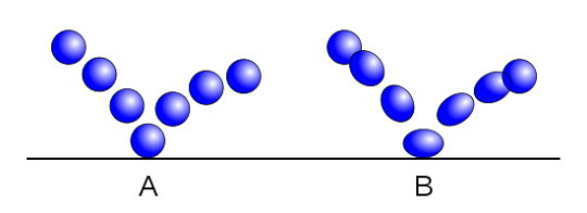
1. Squash and stretch
If you’re interested in animation at all, this one is the one most people can name. It’s the illusion of compression and pulling of mass within an organic object.
In still images, you can use squash and stretch to your advantage, to add a little more vitality to an expression or gesture. For example, look at Pinocchio here.
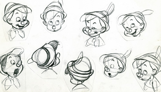
His smile in the middle there is given a little more oomph by the compression of his face, while his look of surprise on the left there is emphasized by the elongation of his face. In your own face, you an see squash and stretch at work when you make an exaggerated angry face and all of your features squish toward the middle of your face, or when you open your mouth wide and everything pulls a little.
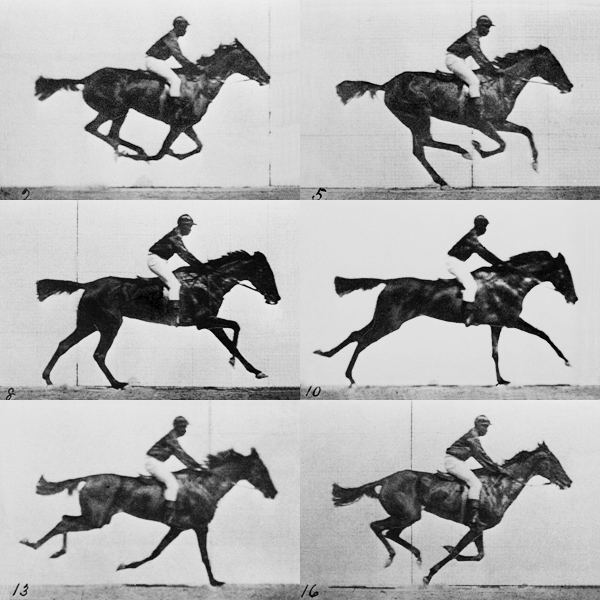
2. Antici... pation
Essentially this is preparation for a movement. For example, if you’re drawing a punch, the movement is the punch itself. But there’s an anticipatory movement of the arm drawing back and body twisting, to prepare for the primary movement of the punch itself. We can see this in the first panel of this baseball player getting ready to throw the ball.
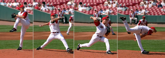
This one is a little more nuanced to use in 2D illustration, but can definitely be used to great effect. It can give a sense of potential energy within an image, of being on edge for something to happen.
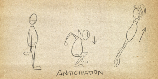
In a single image, you can also draw both the anticipatory action and primary action together, and this can also create the illusion of time, and thus, motion, happening.
3. Staging
This one can be a very subtle means of conveying animation and life in a 2D image. If you’ve ever worked theater, you know that during a scene, where you place your characters is very important. Where you place them is going to help direct the audience’s eye toward where drama is happening, or away from places you don’t want them seeing. Viewing at certain angles is going to not only look better, but allow the audience to better read the expressions on the actors. This can be done in simple things like how you position characters when they’re talking to each other, by turning them outward, slightly, rather than having them speak head-on. It’s not technically realistic, but your audience isn’t really going to pay attention, and it’s going to look better. #aesthetic.
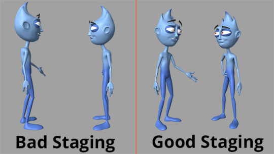
You can implement this in a single character by themselves, and their silhouette.
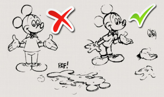
And you can do this in the composition itself, to lead the viewer’s eye toward where you want the action to be focused.
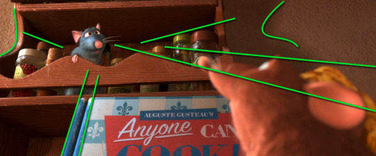
4. Straight Ahead Action vs. Pose to Pose
This one, admittedly, is a little harder to apply to 2D illustration. But it can be, if you tweak it a bit. In animation, this is referring to two different approaches to drawing a scene. Straight ahead means you go from frame 1 to frame 10, in that order. Pose to pose means you draw out the key frames, like frame 1, 3, and 7, and then draw the interval frame.
In 2D illustration, I would hearken this to drawing with guidelines, and drawing straight ahead. Drawing with guidelines, drawing the important parts first then filling in the rest, will give you consistency and help you stay on-topic for what you’re trying to do. Drawing straight ahead, such as drawing the head, then the neck, then torso, etc., is going to give the drawing a little more exaggeration and life, but it’s very easy to go off-model or make mistakes.
5. Follow Through and Overlapping Action (and mirroring)
This principle relates to giving and object the sense of obeying the laws of motion. Follow-through relates to looser parts of a character or object’s mass, that continue to move though the person or object has stopped. For example, hair, loose clothing, loose skin, will stop a little bit later than the rest of the body. A basset hound might run into the wall, and then a second later, its ears slap the wall. Follow-through is one of the BEST principles for giving a 2D image the illusion of movement. The loose elements of a character can show exactly where they just were. Even if the character isn’t moving, drawing their hair or a scarf moving around is going to very easily fool the audience into thinking the character is moving.
Overlapping action is the idea that different parts of the body have different timing. If your head is bouncing, that’ll probably have a different timing than the walk cycle. This would be starting another movement, before the first movement has terminated, continuing after it has. So, say you show a character jumping, the legs might stop, but the arms and torso continue moving for another couple of frames. So, in 2D illustration, if I’m drawing a character stopping their twirl, I can show the hair still moving and starting to slow down. Or, say I were drawing a character landing, crouching and ready to attack, I can show the hair coming down, their body station, and then their hand grabbing a dagger, ready to attack--which helps build anticipation.
And related to these two is the concept of avoiding mirroring. Symmetry in movement. For example, take a look at Pacha here:
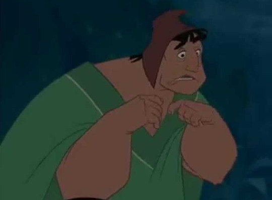
His hands are doing related actions, but not mirrored. This helps create a sense of organic life. Even if the limbs are doing the same thing, you can show minute differences, such as if you have a flying character, you can show the wings fluttering slightly differently. In expressions, you can avoid mirroring by having an expression slightly tilted or squished to one side.
(In a subversion though, mirroring can often show power in a character. Solidity, sturdiness. Inorganic-ness.)
6. Slow In and Slow Out
Again, this one’s kinda more for animation and less for 2D illustration. But can be tremendously useful in sequential art, like comics and panelling. The premise though, in animation, is devoting more time to the beginning and termination of an action, rather than the middle. There are more frames at the beginning and end of a punch, than during the middle. We can take this as emphasizing the beginning and ends of an action, rather than using the middle. Show a punch either at the beginning, or the end--rather than in the middle of the swing.
7. Arcs
Funfact: organic motion tends to move in arcs--not in straight lines! The bounce of a walk cycle follows an arc. The swing of your hand follows an arc.
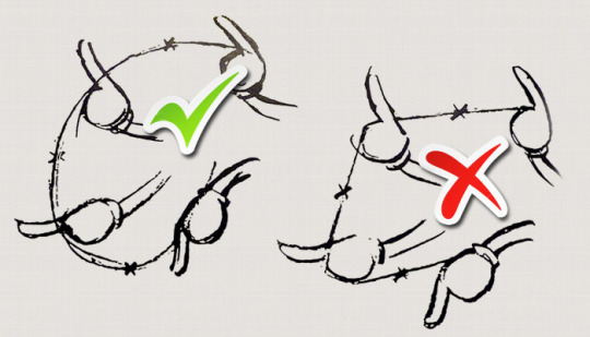
Even implementing arcs in your gestures and guidelines can help create the illusion of movement!
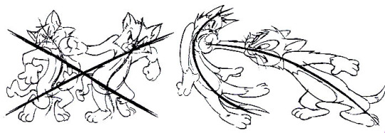
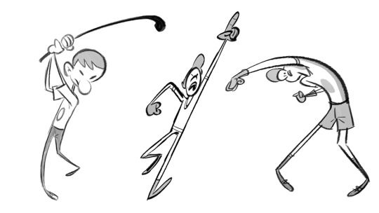
8. Secondary Action
Honestly I’d probably lump this one in with overlapping action, but try to have a secondary movement, when drawing a character. For example, having a character swinging their arms when they walk, swinging their hair, swinging a yoyo, things like that. So long as it is emphasizing the primary movement, and not drawing attention away from it.
9. Timing
Related to staging, in 2D art, how you compose an image can create a sense of time. In Western media, we read left to right. Knowing this, we can place things in certain ways in the image, so that the reader’s eyes follow a natural line that gives a sense of motion. Placing the person about to throw a baseball on the left, and then the batter on the right, then a panel following with the pitcher throwing the ball, creates the illusion of stalling. Of the camera lingering, before the pitcher throws the ball. Whereas you place the batter on the left, and the pitcher on the right, followed by a panel of the pitcher throwing the ball, this will create a different feeling of time. The first is Pitcher........ batter, throw, whereas the second is Batter.......... pitcher, throw.
You see what I mean?
10. Exaggeration
This one has a lot of subjectivity to it. Exaggeration can really help give a scene a lot of energy, Push a character from slightly falling over to heavily falling over creates a lot of dynamicism, but at the same time, can sometimes take away from a more serious tone wanted for the scene. And, of course, this can depend on the level of realism one employs in the first place. But even when drawing more realistically, don’t be afraid to push things, just a little. Sometimes knowing when and how to do that can really make things pop and grab the reader’s attention.
Personally, I try to go by Van Gogh’s philosophy: Exaggerate the essential, leave the obvious vague.
11. Solid Drawing
This is your basic know how to draw shape and form. In order to know how to animate, to bring life to an illustration, you have to be a good draughtsperson. Someone who understands the principles of drawing, of art, and how to translate 3D forms into 2D shapes. Which means doing realism studies. Sorry, no gettin’ out of that one.
12. Appeal
This is just knowing how to employee Golden Means, how to compose things in a way that is pleasing to the eye and draws the reader in. Giving characters charisma, as it were. Likability, even if they are not sympathetic. This helps engage the viewers, and get them to care about what is in the image, rather than having them skim over the image and move on. This one takes a little time to really get, but will become second nature as you go through art.
There you have it! I’d really recommend looking up various sources on the 12 Principles of Animation, as it is one of the best tools I’ve ever found for helping to give the illusion of life in a static image. c: Hope this all helped!
20 notes
·
View notes
Text
Wow…The sun is too bright for me…I think after spending the last month absorbed into Persona 5, something inside me clicked; an addiction of sorts, a lust, a sort of urge to explore more of the Shin Megami Tensei universe, through any means possible – Especially given that after over 150 hours of painstaking, mask-ripping, Reaper-slaying trauma through my first and second full playthroughs of Persona 5, I missed out on that glittering Platinum trophy by missing one request.
*Insert the sad trombone cue here*
Shin Megami Tensei, first released on the 3DS in 2013 is the fourth numbered title in the Shin Megami Tensei franchise, with many comparing it to it’s numbered predecessor, Shin Megami Tensei III: Nocturne (Or Lucifer’s Call if you’re here in the EU) to pick apart it’s pro’s and con’s.
Story
SMT IV (Or just SMT4 to keep it short’n’snappy) is a turn-based JRPG set in the Eastern Kingdom of Mikado. No, not the pocky sticks of the same name (Although I am a sucker for ’em)! You fill the role of [INSERT YOUR NAME HERE] (Canonically named ‘Flynn’), an 18-year old teenage boy from the nearby village of Kiccigiorgi attending a coming-of-age event known as the “Gauntlet Rite”, a sacred and ancient ceremony where the holy monks and samurai of Mikado present a legendary gauntlet to the 18-year old citizens of the county to determine it’s next wielder/s…
You attend this rite with your childhood friend Issachar, where, lo and behold, you are accepted as one of the gauntlet’s new users, alongside four others – Isabelle, Johnathan, Walter and Navarre; you lead the life of a Samurai Prentice, abandon your old life (And Issachar too; just don’t look too much into his poor puppy-dog eyes, it looks like someone just kicked his puppy), and begin your work defending the Eastern Kingdom of Mikado against some truly…Otherworldly entities.
From here on out, the world is yours to craft through whatever Alignment you choose – These being Law, Neutral and Chaos. Feel like a righteous hero and want to uphold the Samurai code upon all else? Go Law. Feel like an arsehole and want nothing more than to gain total dominance and power? Go Chaos. Or want to just see where the game takes you? Go completely Neutral. Be warned however, that if you plan on playing SMT4’s sequel, SMT4: Apocalypse straight after SMT4, you may want to go for the Neutral Route.
Gameplay
Now, let me begin this review by just saying this. If you’re coming straight from Persona, and have never dabbled into an SMT title before, then be warned:
This game will KICK. YOUR. ARSE. …Multiple times, of course.
Similar to the Soulsbourne games, you will die a heck of a lot even during the tutorial sections – In fact, SMT IV is known for it’s recklessly hard tutorial, and first 2-5 hours. Prepare to grind, fuse and pray to the almighty various deities above to be able to survive these sections – Planning and coverage here are your two greatest allies, as having a demon for each element and a spell for every circumstance truly cannot be handy enough.
The gameplay in SMT4 serves as a natural evolution of SMT’s Press Turn system, seen in previous games such as Nocturne and Digital Devil Summoner – You have a party of 4, being you and 3 demons, and any supporting characters you may have (These guys however are under AI control); each of your party members get a single turn, where you can perform a single action – Hitting an enemy’s weakness, or getting a critical hit gives you a second turn, increased stats, and more damage output once per character per battle phase; if you’ve played Persona 5, it’s pretty much the same as the Once More system used there if it seems I’m overcomplicating this.
The world is usually traversed in two forms – The overworld is commonly navigated using a sort of Visual Novel-esque location list, which can get kind-of confusing with more complex areas, whereas Dungeons and Demon Domains are navigated on foot, in fully explorable, player-controlled 3D spaces. Random encounters work here exactly the same as in Persona, or other such titles like Spectrobes, with you getting a quick bit of damage off on enemies if you attack them first, and vice versa. One thing, however, that you’ll quickly find is that you will need to resort to two things to progress through the game:
A) DLC quests B) Grinding like a mad bastard
This is where the game halts to a complete stop, as you find yourself more often than not curbstomped by random encounters rather than progressing at a regular, maintainable pace – DLC quests are relatively easy, and offer a crapton of EXP, however grinding takes absolutely ages, and can really put a roadblock in your way.
Trying to find your way and understand what you need to do can also be a bit of a challenge, and can more often than not make you want to turn off your 3DS in pure rage – More time should’ve been invested into something as simple as a little icon to say “Hey, you might want to check this place out!!”…
Visuals
Now, this is where I get a bit…Conflicted. Overall, the visual style of SMT4 is good – Menus are responsive and flashy, albeit sometimes difficult to navigate; environments look good on the 3DS, considering what it has to work with, however character models and some of the sprites just look…Bizarre. There seems to be a serious divide between the old SMT artstyles and the new SMT artstyles, presumably through a change in directing artist. You can look at an enemy such as Napaea, and look at it alongside something else such as Medusa and wonder if they’re even meant to be part of the same game.
It’s certainly a bit of a divide, and personally, I would’ve preferred it if they went all-out with either the old style, or the new style. The reason this works for something like Persona is due to the art being translated to 3D space – That is impossible using 2D sprites, since you can VERY easily tell when something has been digitally or hand-drawn, which you can with SMTIV. I even started a little game where I would try to guess if the demon designs were new or old! Try for yourself…
#gallery-0-4 { margin: auto; } #gallery-0-4 .gallery-item { float: left; margin-top: 10px; text-align: center; width: 33%; } #gallery-0-4 img { border: 2px solid #cfcfcf; } #gallery-0-4 .gallery-caption { margin-left: 0; } /* see gallery_shortcode() in wp-includes/media.php */
Other than that though, every other aspect of the game, especially the spells, attacks and ‘execution animations’ are visually stunning, and look great even on the 3DS’s small, low-quality screen.
Soundtrack
Similar to the visuals, the soundtrack has two distinct ‘types’ – Really, REALLY damn good, or really, REALLY damn generic; nearly every single battle theme and some of the overworld themes, however the other half of the overworld themes and dungeon themes just seem so…Generic.
Themes such as the Boss theme (B2), Domain Boss theme (C3) and the standard Battle theme are all god-tier, in my eyes, however don’t expect to be jamming out to something similar to The Days When My Mother Was Here or The Whims of Fate in Persona 5.
Overall, after my first few hours into SMT4, I really am enjoying it – It has a lot of flaws and issues that drag it down, but for a first-timer’s introduction into SMT, it’s pretty good. I just wonder if there is a better place to start than this…
I rate Shin Megami Tensei IV a 7.5 / 10.
Here’s hoping my opinion cultures a bit more the further I get into the game.
Ever since Joe spent over 150 hours in #Persona5, he's been looking for a challenge...Say 'hoy' to #SMT IV!! #3DS Wow...The sun is too bright for me...I think after spending the last month absorbed into Persona 5, something inside me clicked; an addiction of sorts, a lust, a sort of urge to explore more of the Shin Megami Tensei universe, through any means possible - Especially given that after over 150 hours of painstaking, mask-ripping, Reaper-slaying trauma through my first and second full playthroughs of Persona 5, I missed out on that glittering Platinum trophy…
0 notes